Wednesday, October 19, 2011

My Logo


How I made this logo:

I first started my logo by researching what my name meant, apparently my name means "lion" which I thought is strong, rapid and intelligent. I didn't want to do a lion as a logo, so I tried to find out which animal could represent those characteristics. After a bit of researching, I thought of doing an eagle. The eagle is strong, intelligent and rapid. 

After some brainstorming, I thought about drawing just an eagle with a shield. That covered up intelligent and rapid, later on I just added a muscle arm to show strength. Before I wanted to make a ninja with a muscular hand, but thought eagles would be a better idea.

After doing a bunch of sketches and scraps of this logo, I decided to make mine red and black. At this point there was no background, but only a picture of an eagle with a shield. As a builded on; I switched colours, shapes, line quality and type. I went from red to green to blue to yellow and finally orange. I changed the shapes of the wings and the tail. Also thought it would look better if there was a  circle in the background too. I changed the line thickness and the directions there going to. I changed the type to just my personal logo. I chose the colour because I guess it just looks cool like that out of all the other logos, its very vibrant and attracts peoples eyes to it. There are actually two circles in the picture, I did it so I can make the nice shadow effect. Also one circle is overlapping the other to make the one of the top look more important to get the viewers attention at the center of the logo. 

After drawing many sketches on paper, I moved on to computer. I use Adobe Illustrator CS4 to create the logo, I barley knew how to use the program at first, but I managed to figure out the basics and create some nice stuff. I learned about the tools you can use in the program, the layers and many special effects with the tint. Layers are very important because without them you would have to remake the whole thing if you made a mistake. Tools such as the pen tool, is very helpful because its really easy to use it and control your lines (e.g lines, direction. etc.) 

I am pretty happy with my logo because it really does stand out from the other ones and personally I think it just looks cool. If I had more time I would probably just add more detail or make it more simple, it depends on the situation. Now that I know more about Illustrator, I would probably like to know more about photoshop, maybe just how to edit pictures (e.g remove pimples, red eye removal, etc.)

Bellow are some old ideas for my logo:


Composition Elements of Photography

Here are some links that can give you really good photography composition elements:

This website is really helped me learn more about photography, this site is really easy to use and it will help you a lot! http://www.photographymad.com/pages/view/10-top-photography-composition-rules

This is a really good example of the Rule of Thirds you can learn from the site above.

This particular website is also very informative because it has some useful knowledge, easy to use, and helpful for me: http://www.digital-photography-school.com/5-elements-of-composition-in-photography

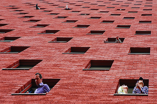
Here is a picture that shows Pattern in photography from the site above

Wednesday, October 5, 2011

By Roy Lichtenstien, "Whaam"

I will be judging this picture by, Imitationalism, Formalism and Emotionalism! Imitationalism means how close to reality is this picture. Formalism means how the good were the elements of design were used. Emotionalism means how much emotion this picture demonstrated. Let's start with Imitationalism!

Imitationalism
The picture "Whaam" by Roy Lichtenstiemn isn't exactly realistic, but I can tell what it is and how realistic it is. The objects presented in this picture have realistic line and tint. The picture itself is really bright and uses pretty much warm colours. The background isn't really realistic either because its mostly just purple and nothing more. The flames aren't realistic, but I can tell it's there. The shapes look really realistic as if its there. I would say this is 50% realistic because this does not look like a photograph, but is able to be identified. 

Formalism
I think this is an excellent piece of artwork judging it by formalism. The tint is well demonstrated in this picture. The lines in the picture are in excellent condition by their movement. The texture is well portrayed too. The shapes are smooth and look as if it's really there. The variety of colour is very well presented because its in the right place and neatly done. The negative space is also well shown with this picture. This is an excellent artwork judging by formalism.

Emotionalism 
 I think this doesn't give too much emotion because it's not unusual to see a war scene in everyday life, movies, pictures and books. This is just looks like a normal picture from a comic, but doesn't give me any feelings. Maybe fifty years ago this picture might be good in emotionalism because of the wars the recently happened. Judging by emotionalism this a poor piece of artwork.


Distorted- Third Class Carriage


Our class has created this picture using big blocks of paper and charcoal, we each got squares and put this piece together!