Here is what I've created out of simple clay and some other regular school materials. What I did was; make a stage out of popsicle sticks and paper I could find, made some props (camera guy, microphone and stand) and made a figure of Justin Bieber. Then I took pictures with a camera and combined them all to created this short clip. If I had to improve this, I would probably just add a bit more detail on the props. I think this worked out pretty great and funny.
Wednesday, December 21, 2011
Monday, December 12, 2011
Surrealism: Global issues
This picture is called "Drop-out"

My Design Process:
I chose my topic on dropping out of high-school, it's a major issue in the world and I tried to represent it in my picture. Here, in this picture; it expresses how a person is fading from school onto the streets. I created this picture by combining two pictures together and then changing colours which make it surreal, you wouldn't really see this in real life, but this looks real. My first idea was to find two pictures that I can blend into one, I took a picture of my friend walking down a hallway and then took another of an old alleyway. Later on, I watched and read a bunch of tutorials that can help me succeed me to make the picture. After I've completed putting two images into one, I decided that I should add something cool, like the colour change. Therefore I made it blue/dark.
Concept:
I showed my idea in this picture by making a person fade from school onto the streets, making people think what does this mean? You can see the lockers which are fading into a brick wall and the hallway to the alleyway. I made the picture darker so it would look more serious and added blue just to make the picture not so boring for the viewer to look at.
Procedure:
I made this picture by studying some photoshop tutorials on the internet on what I needed. First I had to import the pictures into photoshop, then I cropped out some of the details I didn't need. I put them into two layers and then just changed the opacity of one layer to around 40% so you can see the other layer behind which created the effect of 2 pictures put in one. After that was done, I was pretty much sure what picture I am going to go with, but I just played around with colours until I was happy with what I have.
Wednesday, November 23, 2011
Photoshop cool effects tutorials
Here is a video of a colourful aurora effect:
This is was a really interesting video for me as a beginner.
Optical Toys
http://courses.ncssm.edu/gallery/collections/toys/opticaltoys.htm is a site that shows some of the most extraordinary optical toys that were created a long time ago, the site itself doesn't look too pleasing, but the information it gives is good. On the site it shows 12 pictures of optical toys, if you click on the pictures you will be transferred to another page explaining about the toy (how it works/history of the toy.)
We are now learning about optical toys and I found one quite interesting for me, it's called Thaumatrope. I've seen this before and created one actually. John Ayrton Paris created this in 1825. What it basically is, a disk not much bigger then 15 cm in diameter with 2 drawings on each sides, its then tied 2 strings on opposite sides of the circle so you can spin it. After that is complete, you need to make sure you can line the two drawings up properly so you will be able to see 1 drawing out of the two.
You can check an animation of the Thaumatrope here.
Tuesday, November 15, 2011
Working in photoshop
Hello, it's my first time working in photoshop and here is what I've created:

I made this picture by combining characters from different games and putting them into one picture, I made some characters small and some large. I hope I can learn more to create better work, right now I only know some basic knowledge. On the next day, I created this by getting a picture of a head, then cutting out where the brain is going to be, and then added an x-ray picture of a computer.


Thursday, November 10, 2011
Friday, November 4, 2011
Surrealism - Max Ernst
Please take your time to check out my presentation on surrealism and Max Ernst
http://prezi.com/tx5vk9pserdi/surrealism/
http://prezi.com/tx5vk9pserdi/surrealism/
Tuesday, November 1, 2011
My Chess Piece

I drew another picture, this one is a chess piece in 3D. It has proportion and background rhythm.
Proportion:
This has good shading, you can tell this has a 3D effect and I made that by using good value skills. I used light to make sure it's accurate and be able to identify the dark and light spots.
Background Rhythm:
The background rhythm shows chess pieces, the one to the right is the closest to the viewer and the one the left is the farthest one. It show rhythm by repeating the same object which makes your eyes move in the direction I want you to >:D
Wednesday, October 19, 2011
My Logo
How I made this logo:
I first started my logo by researching what my name meant, apparently my name means "lion" which I thought is strong, rapid and intelligent. I didn't want to do a lion as a logo, so I tried to find out which animal could represent those characteristics. After a bit of researching, I thought of doing an eagle. The eagle is strong, intelligent and rapid.
After some brainstorming, I thought about drawing just an eagle with a shield. That covered up intelligent and rapid, later on I just added a muscle arm to show strength. Before I wanted to make a ninja with a muscular hand, but thought eagles would be a better idea.
After doing a bunch of sketches and scraps of this logo, I decided to make mine red and black. At this point there was no background, but only a picture of an eagle with a shield. As a builded on; I switched colours, shapes, line quality and type. I went from red to green to blue to yellow and finally orange. I changed the shapes of the wings and the tail. Also thought it would look better if there was a circle in the background too. I changed the line thickness and the directions there going to. I changed the type to just my personal logo. I chose the colour because I guess it just looks cool like that out of all the other logos, its very vibrant and attracts peoples eyes to it. There are actually two circles in the picture, I did it so I can make the nice shadow effect. Also one circle is overlapping the other to make the one of the top look more important to get the viewers attention at the center of the logo.
After drawing many sketches on paper, I moved on to computer. I use Adobe Illustrator CS4 to create the logo, I barley knew how to use the program at first, but I managed to figure out the basics and create some nice stuff. I learned about the tools you can use in the program, the layers and many special effects with the tint. Layers are very important because without them you would have to remake the whole thing if you made a mistake. Tools such as the pen tool, is very helpful because its really easy to use it and control your lines (e.g lines, direction. etc.)
I am pretty happy with my logo because it really does stand out from the other ones and personally I think it just looks cool. If I had more time I would probably just add more detail or make it more simple, it depends on the situation. Now that I know more about Illustrator, I would probably like to know more about photoshop, maybe just how to edit pictures (e.g remove pimples, red eye removal, etc.)
Bellow are some old ideas for my logo:
Composition Elements of Photography
Here are some links that can give you really good photography composition elements:
This website is really helped me learn more about photography, this site is really easy to use and it will help you a lot! http://www.photographymad.com/pages/view/10-top-photography-composition-rules

This particular website is also very informative because it has some useful knowledge, easy to use, and helpful for me: http://www.digital-photography-school.com/5-elements-of-composition-in-photography
This website is really helped me learn more about photography, this site is really easy to use and it will help you a lot! http://www.photographymad.com/pages/view/10-top-photography-composition-rules
This is a really good example of the Rule of Thirds you can learn from the site above.
This particular website is also very informative because it has some useful knowledge, easy to use, and helpful for me: http://www.digital-photography-school.com/5-elements-of-composition-in-photography
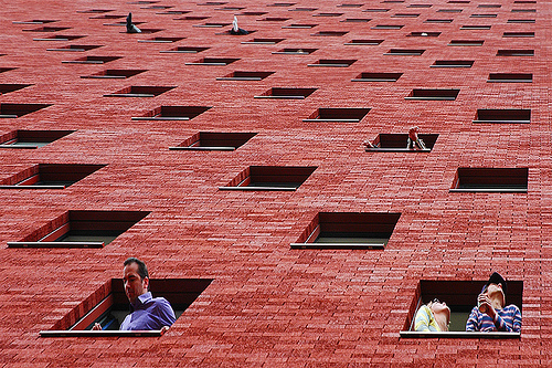
Here is a picture that shows Pattern in photography from the site above
Wednesday, October 5, 2011

By Roy Lichtenstien, "Whaam"
I will be judging this picture by, Imitationalism, Formalism and Emotionalism! Imitationalism means how close to reality is this picture. Formalism means how the good were the elements of design were used. Emotionalism means how much emotion this picture demonstrated. Let's start with Imitationalism!
Imitationalism
The picture "Whaam" by Roy Lichtenstiemn isn't exactly realistic, but I can tell what it is and how realistic it is. The objects presented in this picture have realistic line and tint. The picture itself is really bright and uses pretty much warm colours. The background isn't really realistic either because its mostly just purple and nothing more. The flames aren't realistic, but I can tell it's there. The shapes look really realistic as if its there. I would say this is 50% realistic because this does not look like a photograph, but is able to be identified.
Formalism
I think this is an excellent piece of artwork judging it by formalism. The tint is well demonstrated in this picture. The lines in the picture are in excellent condition by their movement. The texture is well portrayed too. The shapes are smooth and look as if it's really there. The variety of colour is very well presented because its in the right place and neatly done. The negative space is also well shown with this picture. This is an excellent artwork judging by formalism.
Emotionalism
I think this doesn't give too much emotion because it's not unusual to see a war scene in everyday life, movies, pictures and books. This is just looks like a normal picture from a comic, but doesn't give me any feelings. Maybe fifty years ago this picture might be good in emotionalism because of the wars the recently happened. Judging by emotionalism this a poor piece of artwork.
Distorted- Third Class Carriage

Our class has created this picture using big blocks of paper and charcoal, we each got squares and put this piece together!
Friday, September 30, 2011
Disorted Mona Lisa!

Yes, this is Mona Lisa, she has been drawn by 11 students including me! Every single square was drawn by an individual and then put up together to make this beautiful portrait!
Tuesday, September 27, 2011
Logo Analisis
Sony’s logo is made out of logotype. It’s intended audience is mostly everyone. Everyone wants technology, and Sony is the right thing. By the lines of this logotype look likes it a business company that sells products. Looks just letters in a nice font. I can see shapes of letters and by the looks of it the company is strong, so the shape is organic. The colour is plain black. I think this logo works because it just looks professional and simple.
New York Yankee logo is made out of initials. The logo is mostly intended for baseball fans that like the Yankees team. The lines look like it’s a graffiti style/cool lettering that represent the team. The shape looks like it’s a geometric pentagon with letters inside. There isn’t a real colour, this is just another variation of this logo which is black. I think this logo works, especially on clothing and hats. The logo looks very cool.
New York Yankee logo is made out of initials. The logo is mostly intended for baseball fans that like the Yankees team. The lines look like it’s a graffiti style/cool lettering that represent the team. The shape looks like it’s a geometric pentagon with letters inside. There isn’t a real colour, this is just another variation of this logo which is black. I think this logo works, especially on clothing and hats. The logo looks very cool.
Google Chrome logo is abstract visual. The intended audience is probably people who like technology and use the Internet a lot. The lines are flowing in one direction that makes it look like its rapidly rotating. A shape of geometric circles is clearly visible in the middle and the outline of the logo. The colours used in this logo are calm and relaxing for the eye to see. I think this logo works because of its shape and design that is very recognizable.

The Warner Brothers logo is a combination of a pictorial visual and an initials logo. The intended audience is everyone; this company makes movies for adults and children. The lines are sharp and make it look like it’s a strong company. The shape looks like it’s a triangle that’s a little bit rounded. I think the main colour is gold. I thinks its expressing that’s this is a bag company with big money. I think this logo works, looks very neat and cool.
Wednesday, September 21, 2011
Andy Warhol

Friday, September 16, 2011
Subscribe to:
Posts (Atom)